
A company logo remains the most visible element of a Brand’s identity and visual appeal. Most businesses understand that with time they will need to redesign their logos in order to keep up with times with very few corporations continuing with their old logos over the long term. There’s a general understanding that life of a logo is around 15-20 years.
After a logo redesign is undertaken the general public’s reaction is almost always negative. This can be attributed to familiarity with the old logo, but after some time people tend to accept the new logo. Here we will examine our top 10 logo redesigns of 2013.
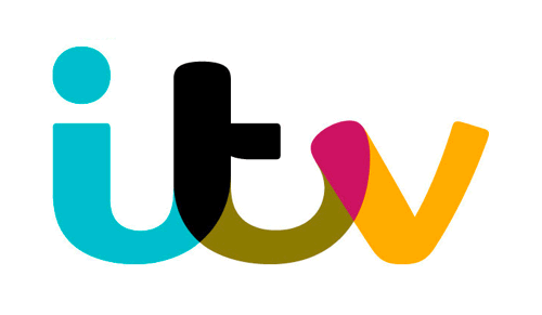
1. ITV
New Logo
Old Logo
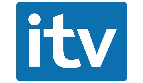
The UK’s second largest broadcaster, ITV, has revamped there logo with a modern new design. Unlike other logo redesigns ITV has introduced more curves in its new logo. Most of the popular logo redesigns of 2013 have removed curves and other elements to give a simpler and more professional look, but ITV has bucked the trend and has introduced new curves and a drastic new logo design which is more colorful than the old one.
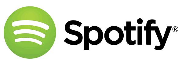
2. Spotify
New Logo
Old Logo
Music streaming giant Spotify got a logo redesign in March 2013. The new logo has introduced some lighter elements in the design which give a look of a more professional company. The famous Spotify globe emblem has lost some of its styling and the lines are now white instead of the green colour of original logo.
3. Facebook
The worlds biggest social media network Facebook updated its logo this year. Facebook removed the faint blue line at the bottom which was present in the old Logo. The “f” has been lowered and now it touches the edge in the new logo.
4. TGI Fridays
New Logo
Old Logo
American restaurant chain TGI Fridays got a huge makeover for its logo in 2013. The new logo has a much more modern and contemporary feel to it. The most prominent change was the drop of punctuations with the apostrophe in “Friday’s” being dropped. TGI Friday has chosen a rectangular look for its new logo although the new logo retains the origina red and white colour scheme and stripes of the old one.
5. Bing
New Logo
Old Logo
Bing updated its logo in line with other Internet giants such as Facebook, Yahoo, Google, Mozilla etc. Bing’s new logo has removed the blue colour which was considered a hallmark of Microsoft and now the new logo is all Orange.
The new logo uses Microsoft’s Segoe font and this new logo redesign was part of an overall site revamp which aims to give users a fresh experience.
6. Philips
New Logo
Old Logo
Philips logo can be said to be one of the most globally recognizable logos, you can be sure to come across it in almost every country in the world. Over the years Philips has come a long way from its roots as a light bulb manufacturer. Philips logo has not been updated for a long time and in 2013 it needed a revamp.
With this rebrand Philips has reintroduced its original shield logo design with some changes such as a curvier look and light and dark lines which were not present in the original logo design of 1934.
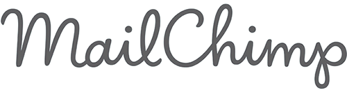
7. MailChimp
New Logo
Old Logo
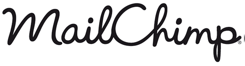
Email marketing supremos Mailchimp also gave their logo a facelift this year. The Mailchimp logo was redesigned by Jessica Hische, who is considered a Typography expert and has a huge fan base among Typography enthusiasts. Mailchimp’s new logo has improved vector design and has a lighter background than the older one.
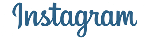
8. Instagram
New Logo
Old Logo
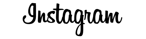
It can be argued that no company has ever risen so fast as Instagram. From its billion dollar sale price to the millions of active users, everything seems to be moving fast in Instagram’s favour. So certainly Instagram needed a new logo to reflect its new identity. The old logo used a casual, playful “Billabong” typeface, new Instagram logo has tweaked this and now it has a neater and cleaner look which appears more professional and pleasant to eye.
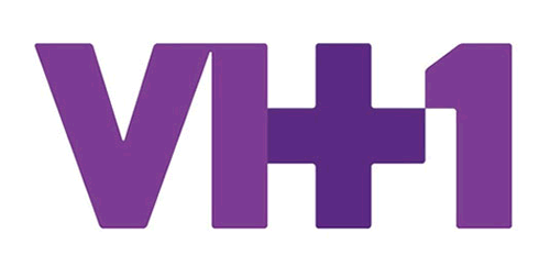
9. VH1
New Logo
Old Logo
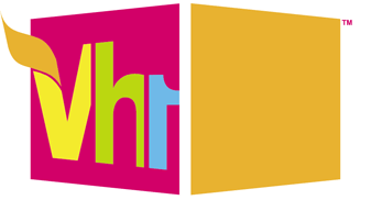
After ITV VH1 became the second main channel to redesign its logo. This has been the first redesign for VH1 in a decade. The new logo incorporates a + sign which was not present in the old one. Overall VH1 has gone for a simple style and according to company the new logo signifies a new identity of Music+ Pop Culture+ Nostalgia for VH1.
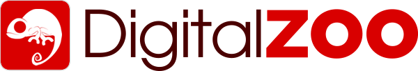
10. Digital Zoo
New Logo
Old Logo
![]()
Digital Zoo are a UK based creative design agency, who went for a complete rebrand in 2013. Their trademark chameleon has been changed from a cartoon illustration into a much more modern and recognisable vector button. The design has given them a much stronger brand which looks great on their new website and range of mouse mats, cup and stationery.